Mobile paywall optimization: 5 actionable tips to increase subscription revenue
The subscription app market has witnessed remarkable growth in recent years. In 2021, global in-app subscription revenues surged to an impressive $18.3 billion, up by 41 percent year-on-year. With an immense financial potential underscored by multiple figures, subscription-based monetization has become a top priority among mobile marketers, especially due to the need for multiple revenue streams during the economic downturn.
However, profitable markets attract new entrants. To succeed in this highly competitive landscape and capitalize on a lucrative revenue stream, you need effective paywall optimization strategies. That is why we have got insights from Steve P. Young of App Masters.
Without further ado, let’s dive right into the five tips that will help you skyrocket your subscription app revenue!
Tip #1: Increase exposure to the paywall
The paywall serves as the gateway for users to access premium content or features within a subscription-based app, meaning that enhancing paywall visibility is crucial to initiate the user’s journey toward subscription conversion. Without users seeing the paywall, they would not have the opportunity to evaluate the subscription offering.
In fact, French publisher AOC increased exposure to the paywall by 64% and saw its click-through rates jump by 329%. Ideally, you should aim at a paywall visibility rate of 100%, ensuring that all users encounter the paywall at least once during their app usage.
Here are some tactics for higher paywall visibility:
- Contextual triggers: Trigger the paywall at appropriate moments within the user journey. This could include when users access gated features or when they reach a point where the value of the premium content or services becomes evident. This approach ensures that users encounter the paywall when they are most likely to consider subscribing.
- Strategic placements: Place the paywall in strategic locations where users naturally focus their attention, such as the home screen or settings menu. This provides consistent visibility and serves as a reminder of the subscription offering without being intrusive. However, be cautious not to obstruct essential app functionality or compromise the user experience.
By implementing these proven strategies, you can maximize your chances of being noticed and converting users into paying subscribers.
Tip #2: Build an effective app onboarding process
The onboarding process plays a pivotal role in shaping users’ initial impressions and setting the stage for their ongoing engagement with your app. Those who end up buying tend to make their minds up even before using your app, as illustrated by a case study in which the majority of users committed to in-app purchases during onboarding.
Hence, it is necessary to pique users’ interest from an early stage by clearly communicating the unique value proposition of your subscription. Highlight the benefits, exclusive features, or premium content users can access only by subscribing.
You can also provide users with guided tutorials or interactive prompts to help them navigate your app’s features and see the subscription as a worthwhile investment. Users may be more inclined to convert if they have already invested time and effort into exploring your app.
A smooth, frictionless sign-up process is another factor that could reduce the risk of drop-offs and motivate users to take the desired action, or the final step of subscribing. Minimize the number of required fields and consider offering social login options to enhance convenience.
An important point is that the paywall should be placed at the last part of the onboarding process. Give users enough time to engage with your app, understand the value of the subscription, and build trust before introducing the paywall. This will help users feel more confident in their decision to subscribe.
Tip #3: Test different calls-to-action on the paywall
Tests allow marketers to make data-driven decisions and optimize for the best results. This is no exception when it comes to building a mobile paywall.
An essential paywall element you can play around with is the CTA button. Its color, size, and placement can all be modified, but the language holds the utmost importance. Try variations of wording and messaging that emphasize the benefits, exclusivity, or urgency of your offering and observe how they influence user behavior.
For instance, an app saw changes in its subscription revenue by creating different versions of the CTA. The test, conducted on iOS and Android users in the United States, the United Kingdom, Germany, France, and Australia, saw positive and negative outcomes. Below is the aggregated impact across both platforms and all countries:
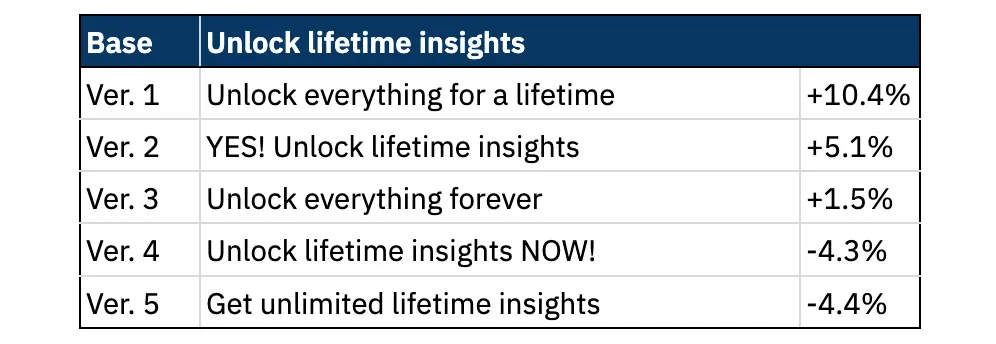
As Steve P. Young says, sometimes, the smallest changes can make the biggest difference. You need to keep testing to find the CTA button that drives the highest conversion rate.
Tip #4: Craft the optimal pricing plan
Creating a pricing plan aligned with user preferences and market dynamics is crucial to boosting subscription revenues. By offering different options and monitoring user responses, you can gauge how price impacts users’ willingness to subscribe, upgrade to higher tiers, or leave.
Differentiate the following elements to find the best combination:
- Billing periods: weekly, monthly, annual, or lifetime
- Intro offers: free trial, pay-as-you-go, or pay-upfront
- Pricing structure: flat-rate, tiered, per-unit, etc.
- Price: higher, equal, or lower than competitors
💡 Refer to this blog post for more information on mobile paywall A/B testing.
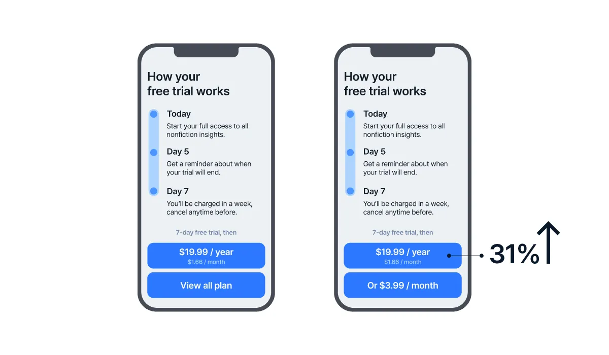
Indeed, there was a productivity app that drove conversion by changing the number of plans displayed. The original paywall only showed the yearly plan, whereas the revised paywall showed both the yearly and monthly plans, as in the image below. This allowed users to see where the value was; with the two plans juxtaposed, users could not help but compare the prices and found the latter to be more cost-effective. Eventually, the app saw a 31% increase in yearly subscriptions.
In addition, a photo editing app generated 38 times more sales over a year through a successful pricing plan revamp.
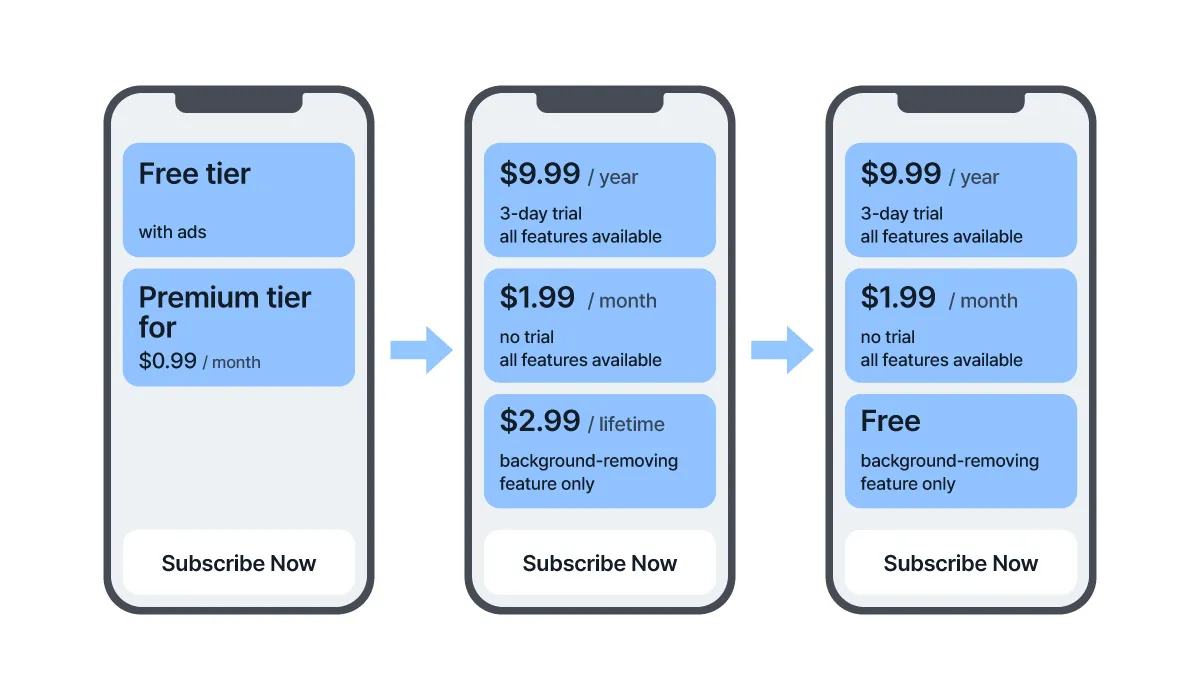
The first set of measures the app took was adding more tiers, increasing the price of the monthly offer, and utilizing decoy pricing. Then, as the installs spiked thanks to some supplementary efforts, the app took the next action – bringing back the free tier, which continued to drive users. Yet, a lot of them ended up paying for the yearly offer since the price was close.
When testing pricing plans, be sure to keep track of metrics like conversion rates, average revenue per user, average revenue per plan, and churn rates to determine what works best for your app and increase your chances of converting users.
Tip #5: Go for a longer paywall
It is commonly assumed that shorter paywalls would outperform longer ones. However, there have been multiple cases where the opposite has been true.
The logic behind this is that users are willing to read all the necessary information when they want to make a purchase decision. Thus, for revenue-boosting purposes, using a longer paywall could be the smarter move because you have to focus on those who will actually convert.
Some of the elements to put on your long paywall are:
- Headline with benefits
- Pricing table(s)
- Features table
- Testimonials & social proof
- FAQs
- CTA button
Just remember to have a floating CTA button; make it remain visible and accessible to users as they scroll down your lengthy paywall.
TL;DR – Summing things up
Paywall optimization is essential for subscription apps hoping to get to the next level. To stand out from the competition and maximize revenue, stick to these five simple tips:
- Increase exposure to the paywall
- Build an effective app onboarding process
- Test different calls-to-action on the paywall
- Craft the optimal pricing plan
- Go for a longer paywall
Try them out today and see the results for yourself.
💡 Steve P. Young is an app marketing expert who has helped numerous apps unlock success. Watch the full livestream for more insights about mobile paywall optimization, and check out other mobile marketing-related videos on his YouTube channel.
准备好革新您的移动增长了吗?
了解 Airbridge 如何帮助领先品牌衡量和优化每个触点。

